4 things not to overuse in PowerPoint
You know the phrase “too much of a good thing?” PowerPoint has four features that are useful when creating a professional-looking and effective presentation. But, like the proverbial “good thing,” too much of them is not good. Here are a few things to consider when using these four features in PowerPoint.
1. Animation
Animation is a useful tool when you want to discuss bullet points one at a time or simulate a screen operation. But if you’re animating every bullet in your presentation, or have things flying around on every slide, your audience will disconnect from you. Always animate for a purpose. Don’t animate just to entertain. Reserve motion path animation for instructional purposes.
A few entrance animations that work nicely are Fade, Zoom and Float In. They cause an object or text to come on your screen in a way that will catch your audience’s attention but not annoy them (unless you use them over and over).
2. Transitions
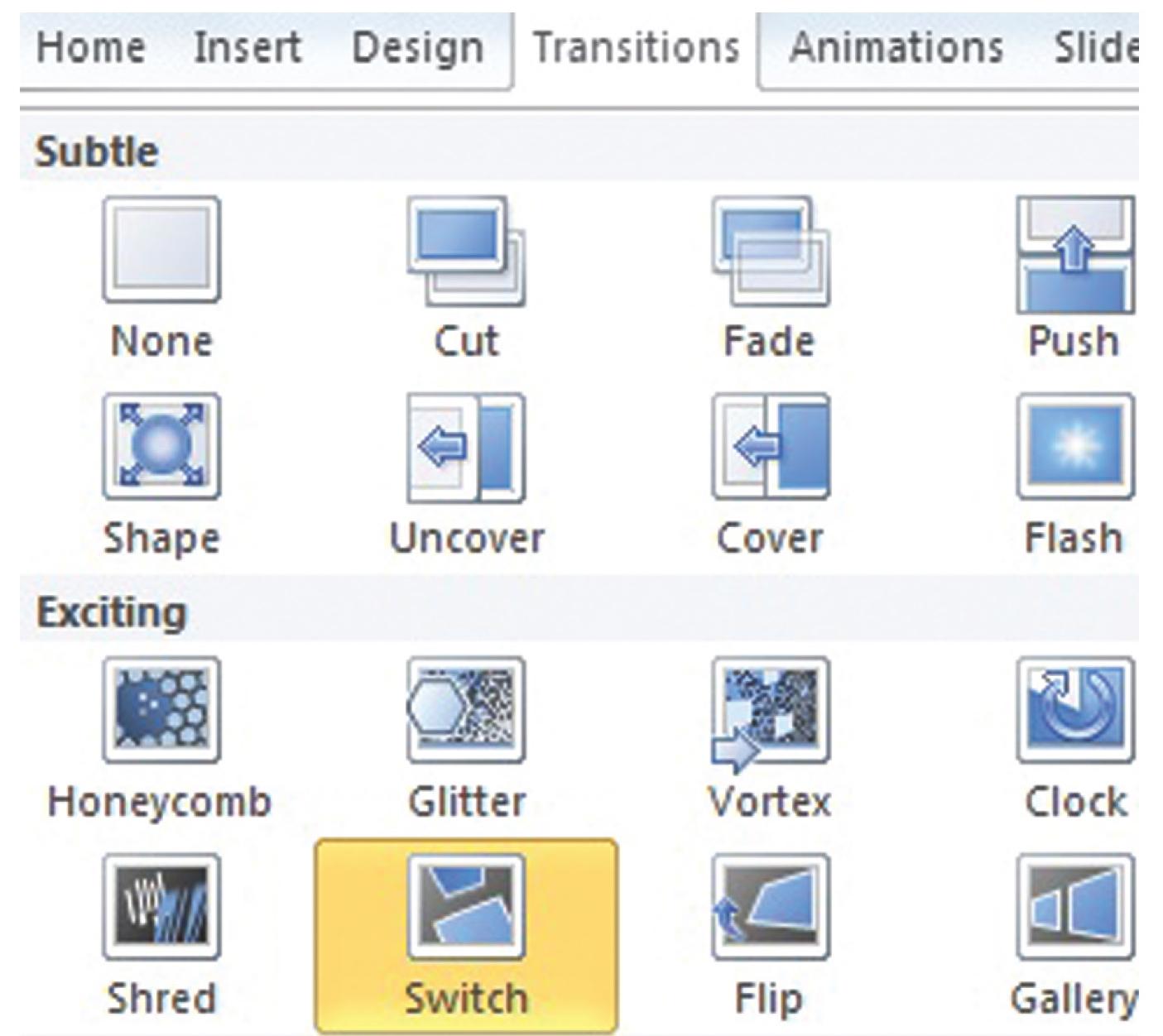
Every new MS Office release brings with it new and exciting ways to transition into a slide. Play with them if you must, but use them sparingly. More and more presentations are happening online. Line speed and presentation portals vary enough that your transitions can go from exciting to exasperating for your audience. You have a little more latitude in a live presentation.
However, like with animation, too much is just annoying. Explore the new animations and try to decide where you might use them. For example, Fade is popular for most slide transitions. However, presenting slide after slide with statistics or other repeating patterns can give an audience “white line fever.” Vortex or Switch is a better option to snap them out of the trance. It’s especially good when transitioning to a slide that says “break” or “lunch.”

3. Bullets
Two thoughts on bullet points: (1) Use the 5:3/3:5 rule, and (2) bullet points are not the only way to communicate your message. What is the 5:3/3:5 rule? Be stingy with the number of bullets and words you allow on a single slide. Set up five bullets with three words each or three bullets with five words each. If a slide contains more information than this, the audience will not be able to read what’s on the slide. Separate long instructions onto several slides, but provide a single page with them in the handouts.
Also, consider diagrams using SmartArt or other graphic objects to communicate your message. If you are talking about a process, show a process-flow diagram. If you are introducing new folks in the organization, put up their photos.
4. Charts and graphs
Charts and graphs on PowerPoint presentations are usually unreadable on the screen. If you have a simple chart or graph with few data series, a chart might work fine. Otherwise, it’s meaningless. If the audience squints at the screen, they’ve tuned out completely!
Consider referring them to a more readable and more detailed chart in their handouts and discuss that. Keep the title of the presentation or the topic on the slide up front, noting the page number in the handout where they can find the details. If you will be presenting in a darkened room, talk about what the charts reveal. General rule: If they can’t see it, don’t show it!